Vlogbrothers View Statistics
Scroll down for nice plots! Watch the video here!
This is a summary of the YouTube statistics of videos by the Vlogbrothers – Hank and John Green. The raw data were kindly provided by kitchensink108.tumblr.com. I focus on two dependent variables:
- Who made it? Hank-only, John-only, or both?
- The second variable of interest is the Date. In other words: When was the video put online?
The data set already contains a few interesting variables:
- The view count (Views)
- The number of Likes
- The number of Dislikes
- The number of Comments
The three latter numbers co-vary (all rank correlations > .7) with the total number of views, so looking at them all separately would be repetitive and boring. So instead I will look at:
- The view count – most of the time I’ll plot the natural logarithm of the view count because of a few outliers (more on those later)
- The Likes per View ratio (overall appreciation)
- The Likes per Dislike ratio (unambiguous appreciation)
- The Comments per View ratio along with the overall number of comments
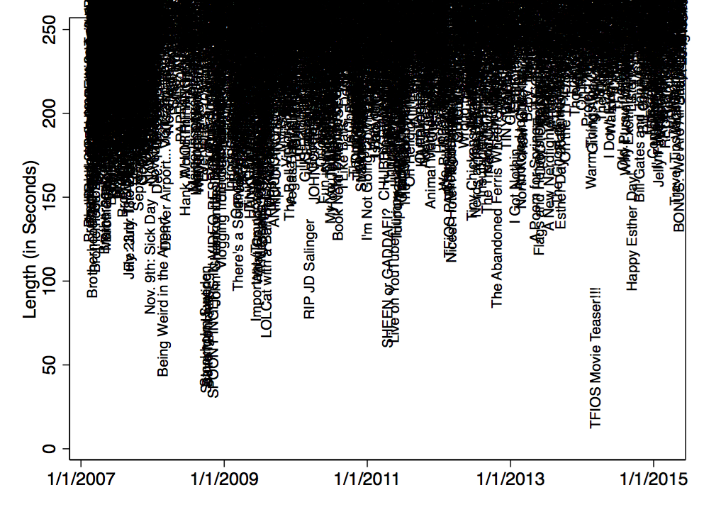
- The length of the videos is not that interesting because most clock in just under 4 minutes. (NB: Longer videos were not included in the original data set.) There is just not enough variation. So I’ll just have one quick plot at the end.
Speaking of plots, most of the analysis will be graphical. This is pretty much a census, so there’s no need for statistical testing. Also, it’s all quite exploratory.
Here we go: Who tends to have more Views?
Here is the median view count for each brother: Hank: 256k, John: 286k, both: 347k. This means that 50% of Hank’s videos have more than 256k views, and the other half of his videos have less than 256k views. So John’s videos tend to get more views, but still less than reunion videos. You can also look at the means (M) and standard deviations (SD) – but there are some influential outliers that impede the interpretation of the numbers (Hank: M = 378k (SD = 537k); John: M =467k (SD = 1112k); both: M =367k (SD = 183k)).
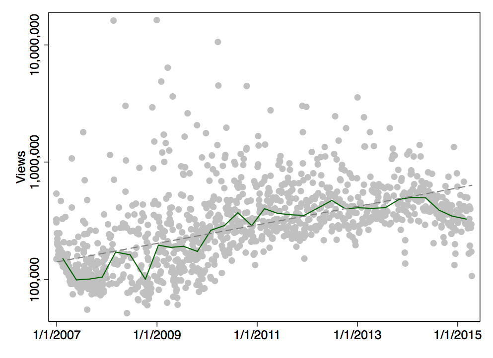
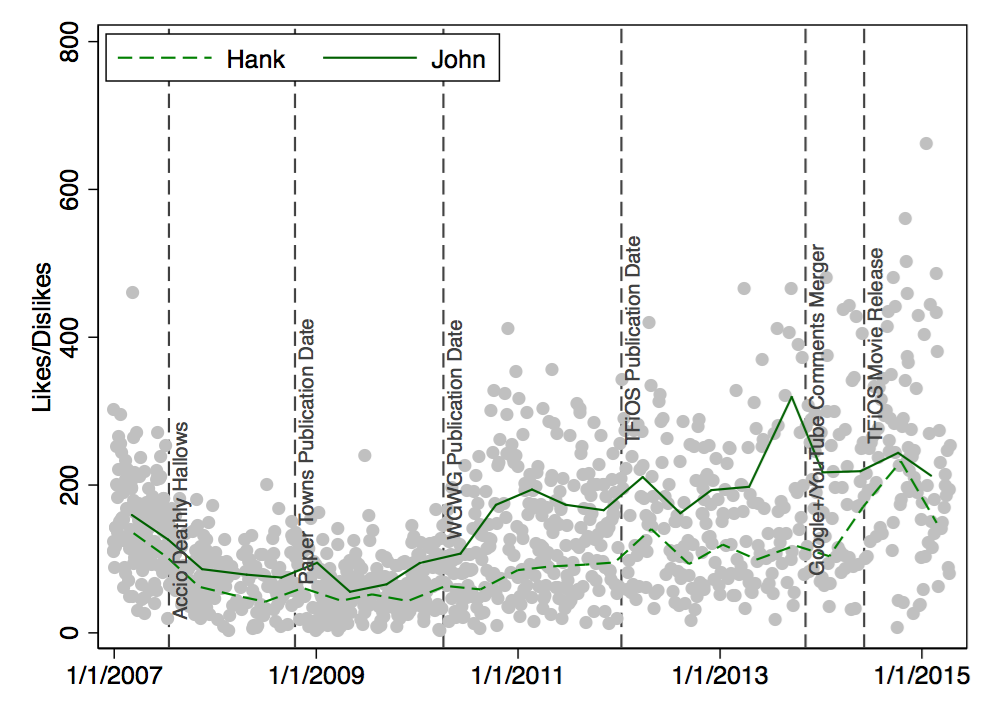
This plot shows the view count changes across time. The solid line is a median band. It indicates how many views a video needs at a given point in time to have less views than half of the other videos.

Each gray point represents one particular Vlogbrothers video. When I add the linear trend (actually, it’s a log-linear trend), it becomes clear that newer videos tend to get more views:
And this is the same plot with some additional Nerdfighter-related dates:
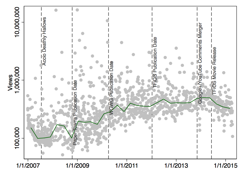
Did the movie version of The Fault in Our Stars lead to fewer views? I don’t think so – this is mostly speculation, anyway. There could be many reasons why Nerdfighters might be watching fewer videos (CrashCourse, SciShow, Tumblr, jobs, kids). Personally, I think that the more recent videos just haven’t accumulated as many views from new nerdfighters who go through old videos (and from random strangers).
Here is another version of this plot, this time with separate lines for John and Hank:
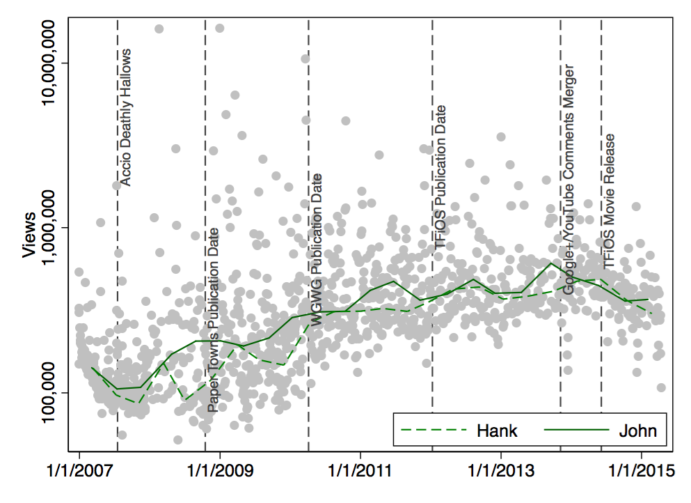
My interpretation would be that the view counts of Hank and John didn’t really develop differently.
So far, so good. Now what about actual appreciation? When I look at the median values for Likes per View, Hank’s videos are liked by 2.3% of viewers. John’s videos are liked by 2.2% of viewers. Reunion videos are liked by 3.3%; Nerdfighters seem to like reunion videos!
Here’s the longitudinal perspective – again no clear differences between Hank’s videos and John’s videos:
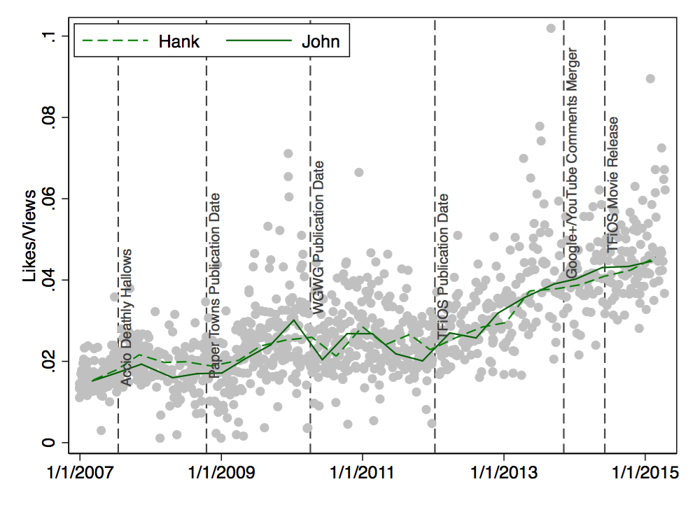
Being liked is one thing. But how about the Likes per Dislike ratio? Here are the median values: Hank’s videos tend to get 78 Likes per Dislike. John’s videos tend to get 126 Likes for each Dislike. And reunion videos trumps them both with a median of 177 Likes per Dislike. Here’s the longitudinal perspective:
There were even more Likes than Dislikes during the past few years. This development occurred especially for John’s videos.
Enough with the appreciation – how about Comments? An eternal source of love, hate, fun, and chaos they are. The overall tendency (i.e., median) is that 0.5%-0.6% of viewers write a comment. Let’s look at the longitudinal perspective of Comments/Views:
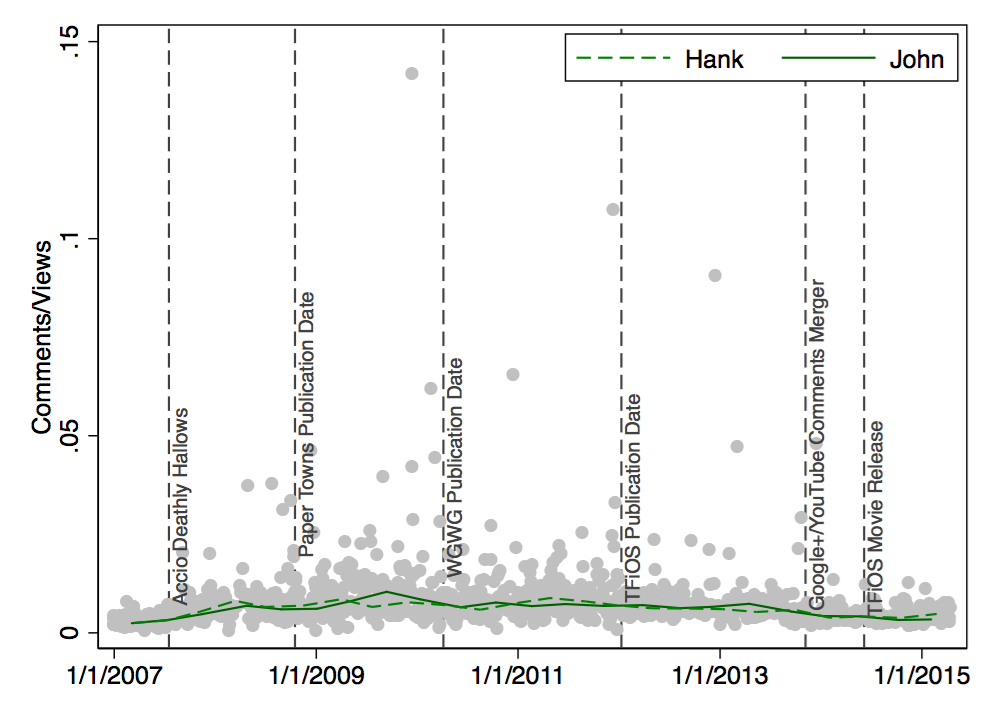
The number of Comments per View has declined over the past two years; possibly due to the integration of Google+ and YouTube or the new sorting algortihm for comments.
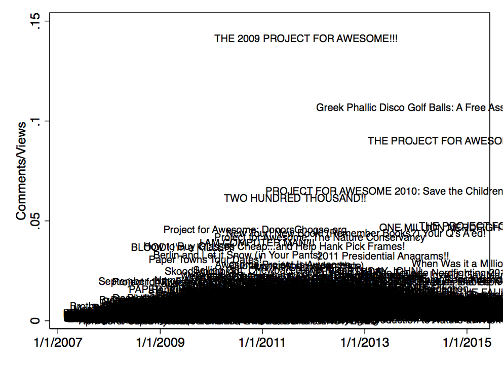
Finally, here’s a quick overview of specific types of outliers. Videos that elicit a lot of comments are mostly about the Project for Awesome:
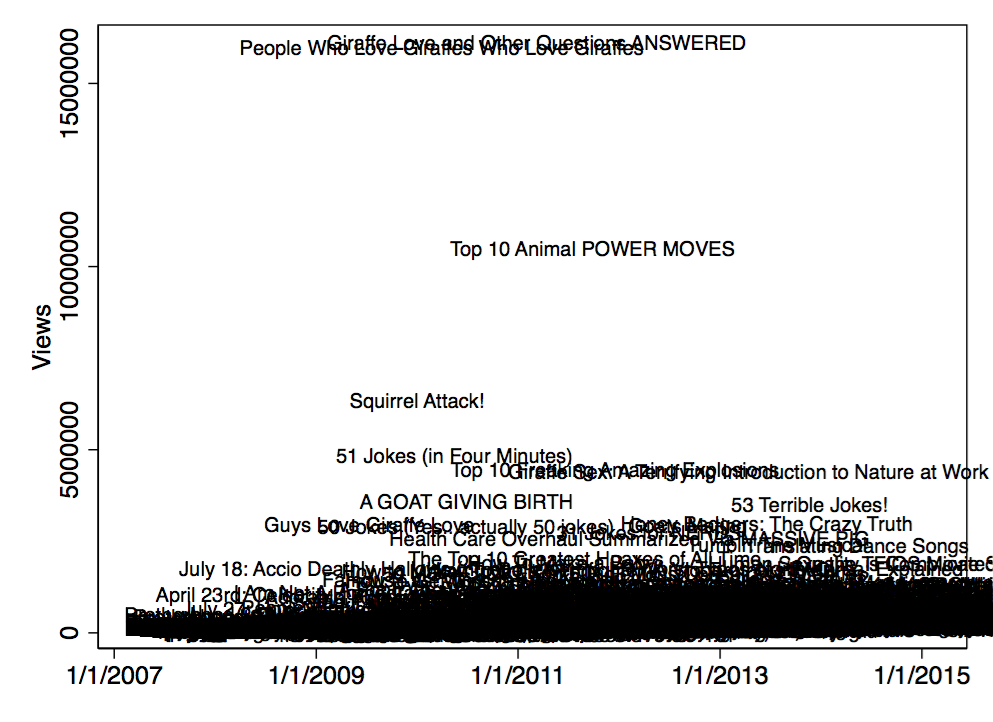
The videos with the highest view count all deal with animals:
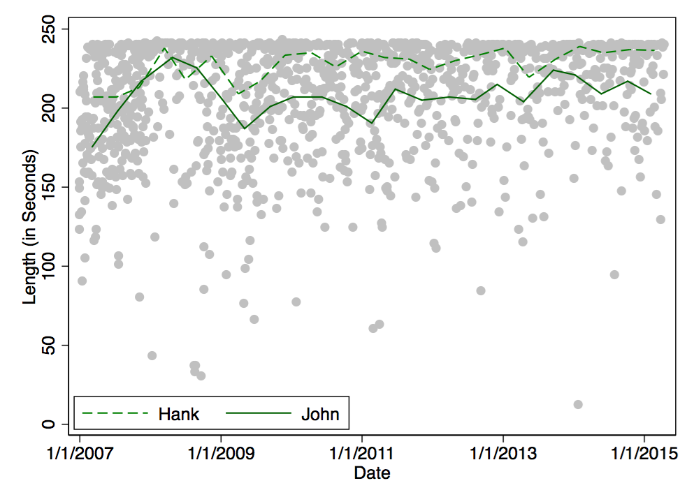
The last couple of plots brings us back to the length of the videos. Here are the titles of the shorter videos.
Not much to say here. And it seems as if Hank keeps making slightly longer videos than John:
That’s all. DFTBA!
PS a day later: I turned this post into a video. The initial text along with the analysis commands are listed in this Stata do-file.
 - click for larger version - see below for full album names")
 - click for larger version - see below for full album names")